Lots of pundits are trying to explain the unexpected dominance of Donald Trump in the Republican primaries, following his Super Tuesday victories yesterday. For example, Professor Bainbridge at UCLA Law offered a relatively convoluted explanation that centered on cultural factors and vague policy grievances among Trump’s supporters.
But to my mind, there’s one chart that explains it:
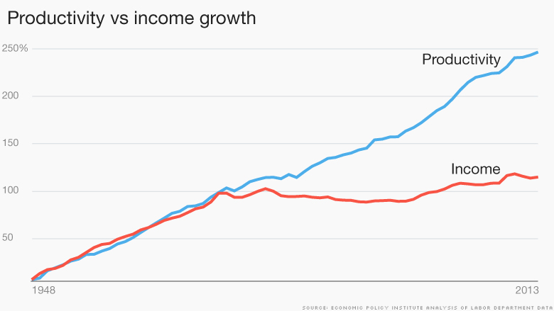 There’s only so long that the middle class will tolerate being left out of the economic growth in this country. Sure, there are cultural factors at play, and you can’t discount the unique individual appeal of a celebrity businessman who’s made it his life’s work to build a personal brand and sell it.
But context matters, and the relative economic decline of America’s middle gives rise to a candidacy like his.
Could environmental policy be helpful here? In the broad sense, yes. Policies that encourage more downtown development in rural areas, deregulate land use to boost housing production in economically successful areas, and boost clean technology such as microgrids and renewable energy could provide an economic help for many communities.
But larger economic trends related to offshore manufacturing and the rise of the service and technology economy will leave these areas in the dust, unless we develop a national plan to resuscitate America’s middle.
Otherwise, what we’re seeing this election cycle may just be the tip of the iceberg.
Leave a Reply
You must be logged in to post a comment.